Huge amount of data and access to information, are driving artificial intelligence and digitization change that has taken industries across in a stride. But all the data and all the information derived from it can become a big time liability – if their purpose and outcome is not understood and aligned to organizational goals.
It is here, that data visualization steps into the picture. It is all about how to present the data, to the right people, at the right time; to provide them with insights in a most effective manner. Charts, videos, infographics and now virtual and augmented reality (VR-AR) presentations are used for engaging and intuitive communications.
Our data visualization expertise transforms messy, massive data sets into insights
The way data is shown and shared impacts the effectiveness of the data to a great extent. We don’t just put data into charts and graphs. We provide effective data visualization solutions, backed with skills and storytelling, prepared by experts with eye for details who understand the business requirements and the audience. Let’s check out what sets us apart from our competition.
1. We use Outliers to illuminate deviators from the norm
2. We highlight Trends to indicate changes over a period
3. We showcase Patterns for repeated consistent characters
4. We portray Correlations for establishing relationship between two or more variable
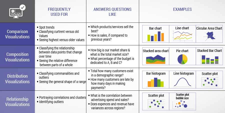
We choose the right kind of visualization
We choose one or more or a combination of more than one from enlisted, of the four fundamental types of data visualizations, each of which delivers specific insights.
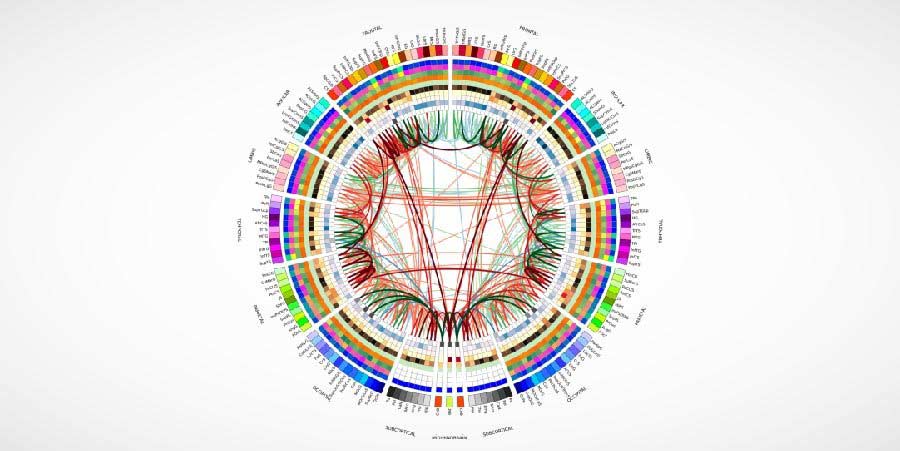
We use attractive colors to emphasize on information
Colors are a powerful tool to enhance the visuals – and we know that well. We give clear cues about relative values, points of emphasis, and differentiation amongst data sets. We use colors carefully and sparingly, as inappropriate colors used can increase the confusion instead of clearing it up.
We use the “KISS” principle, to avoid chartjunk situation
We follow “KISS” principle – keep it simple silly. For every visual that we create, we ask “Which elements here are the most important to the story that we are trying to tell for every single data set”? To adhere to this thought process, we:
- Limit the number of visualization in a dashboard to 9 or may be less – unless the client requires it otherwise.
- In order to emphasize on the information critical to convey the message – we don’t step back on adding callouts.
- A lot of trend lines, is what we put at task to highlight important correlations between variables. It also ensures that the graphs are more scannable.
- To define unique data variables, a wide plethora of size and colors is what we use.
- We avoid excess use of decorative fonts, text treatments such as underline, italics, and visual embellishments such as drop shadows
We adhere to design principles to make visuals look good
We bring that clarity and avoid confusions while assessing complex datasets.
We showcase your data at the right scale, to make visuals correct and not just attractive
Our visualization experts are well aware that improper scales can make major insights seem mediocre and minor deviations feel massive. For correct representation of the story, we show data as:
- We ensure that the scale of axes accurately reflects the size of data that is being visualized
- We select the axes that best represent the trend in the data.
- We also take care if absolute numbers or percentage makes the data clearer or not?
- Using cropped axis and not starting the Y axis at 0 – is not what we practice.
We create visualizations keeping target audience in mind
All said and done it is all about knowing the audience, for whom we are putting together the data in form of visualizations, and what are they interested in. Even the clearest and best looking visuals can turn turtle – if they are not interesting and engaging. We ensure to deliver persuasive story by:
- Highlighting and ordering the information, purely based on audience interest and trends.
- Visualizing data sets in intuitive & conventional manner that facilitates everyone’s understanding
- Conducting dry runs to test the visuals with experienced colleagues to ensure that we convey the story they are interested in.
Final Word
It may be a mere school presentation or a monthly sales report for a manager, or may be a business review meeting; all that is required is presentation of data in a detailed and easy to follow form. Data visualization has shifted the analytics to a whole new level, enabling better insights to business data. Let us know about your data visualization requirements, and we’d love to provide solutions that improve business insights.